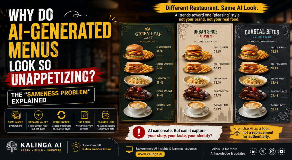
You walk into a cafe, glance at the menu, and something feels off, the bagel sandwich illustration is too perfect, too symmetrical, too smooth, and you can’t say why it bothers you. You’re not imagining it. AI-generated menus have quietly spread across restaurants and cafes, and a growing body of expert opinion and research explains exactly why these images trigger a low-grade sense of unease: the models producing them are trained to converge on one narrow, “pleasing” aesthetic, and the result is food that looks almost real but not quite right, as reported by TechCrunch.
If you work in AI, design, marketing, or you’re simply a curious tech reader in Odisha trying to understand what’s happening with generative AI in everyday life, this is a genuinely useful case study. It shows, in a very tangible way, how large language models (LLMs) and diffusion models behave when they’re asked to generate the same category of content, restaurant menus, over and over again.
What Is the “Sameness Problem” in AI-Generated Menus?
The “sameness problem” refers to the tendency of AI-generated menu images to look nearly identical to one another regardless of the restaurant, cuisine, or brand. Instead of reflecting a restaurant’s actual identity, AI-generated menus tend to default to the same round scoops of ice cream, the same impossibly bubbly cheese, and the same glossy, symmetrical presentation.
This happens because generative models are trained on huge datasets of existing food photography and menu design, and they learn to reproduce the most statistically common patterns in that data. Reality Defender CTO Alex Lisle told TechCrunch that much of this imagery resembles a mid-2010s casual-dining chain aesthetic, because that kind of mass-market fast-food visual style dominated the training corpus the models drew from. In other words, AI-generated menus aren’t inventing a new look, they’re echoing an old one, everywhere, all at once.
Why do restaurants use AI-generated menus in the first place? Restaurant owners often turn to generative AI tools as a fast, low-cost shortcut to refresh their menu design instead of hiring a photographer or illustrator. But as TechCrunch notes, customers can viscerally sense that something is wrong with the food in these images, which undercuts the very goal, making the food look appetizing, that the restaurant set out to achieve.
Why Do AI Menu Images All Look the Same?
The short answer is convergence, a phenomenon distinct from, but related to, the more dramatic idea of “model collapse” that circulates in AI discourse.
Convergence is a one-sentence definition worth remembering: it’s when repeated exposure to a narrow slice of visual style causes an AI model’s outputs to drift toward that one look, degrading variety without breaking the model outright. Lisle compared model collapse to a kind of “mad cow disease” for AI, where feeding a model’s own outputs back into itself repeatedly eventually causes the whole system to break down. Convergence, by contrast, is milder, the outputs get worse and more homogenous, but the system doesn’t fully break down.
Model Collapse vs. Convergence, What’s the Difference?
Model collapse happens when a model is trained too heavily on its own AI-generated outputs, effectively “eating its own tail,” until quality degrades severely. Convergence is a softer, more common version of the same underlying risk, models default to a single dominant aesthetic because their training data itself already leans heavily toward that look, and every new AI-generated image that gets scraped back into training data reinforces it further.
Think of it like a photocopy of a photocopy. The first copy still looks mostly fine. But if you ask an AI model for a fast-food menu, it references existing chains like Wendy’s, Burger King, or McDonald’s, whose branding already shares a similar visual DNA. When that AI output ends up back in a future training set, the loop tightens, and AI-generated menus collectively drift toward the same over-polished, generic style.
The Uncanny Valley Effect: Why Your Brain Knows Something Is Wrong
What makes AI food images feel unsettling instead of just “off-brand”? Researchers at the University of Duisburg-Essen in Germany found that AI-generated food images exhibit an “uncanny valley” effect, where images that looked almost photorealistic triggered more disgust and unease in viewers than images that were obviously, cartoonishly fake.
The uncanny valley is a well-known concept in design and robotics: the closer something gets to looking real without actually being real, the more unsettling it becomes to the human eye. This is exactly the trap that AI-generated menus fall into, an image that’s “almost photographic” reads as far more disturbing than one that’s clearly stylized or illustrated.
Do people actually notice when a menu is AI-generated, even without being told? Yes. Lee Rainie, Director of the Imagining the Digital Future Center at Elon University, told TechCrunch that people have an almost unexplainable, hard-to-articulate sense for when something is AI-generated versus real. This instinctive detection is a big part of why backlash against AI restaurant menus has been so visible on social platforms.
Rainie also pointed to the underlying design incentive behind this effect: these datasets are optimized for “pleasingness,” or avoiding anything offensive, and that pursuit of universal pleasantness ends up producing homogenization, AI tends to shave off the distinctive edges from both images and language. A menu that’s been smoothed into inoffensive, universally “pleasing” perfection ironically becomes the thing people find creepy.
The 100-Edit Experiment: How AI Menus Get Worse With Every Revision
One of the more striking demonstrations of this problem comes from an experiment shared on X (formerly Twitter). A user named Labtec generated a restaurant menu using ChatGPT, then repeatedly edited it, adjusting small details like prices or item names, 100 times in a row, to see how the food imagery would evolve. TechCrunch reports that it replicated this experiment independently and found similar results: with each successive edit, the food images became progressively rounder, smoother, and less like actual food, until the label describes the outcome as making the viewer “uncomfortable.”
This matters for restaurants specifically because of how AI-generated menus are used in practice. A restaurant doesn’t usually generate a menu once and leave it alone, owners tweak prices, rename dishes, and make small seasonal updates. Each of those small AI-assisted edits appears to nudge the food images a little further from reality and a little closer to the same over-rounded, over-glossy “sameness” that defines the broader problem.
Where Does the Training Data for AI-Generated Menus Actually Come From?
Why does training data matter so much for AI-generated menus? Training data is the raw material a model learns from, and if that raw material already leans toward one visual style, every output the model produces will lean the same way. New, high-quality training data is extremely valuable to the companies building these models, TechCrunch has reported that Amazon has even sourced rare, out-of-print books to scan for AI training purposes, only to discard the physical books once the scanning was complete. That example shows just how aggressively AI companies are hunting for fresh, non-AI-generated material to feed their systems.
The problem is that it’s increasingly hard to find data that hasn’t already been touched by AI. As more AI-generated menus, food photos, and marketing images circulate online, some inevitably get scraped back into future training datasets. This creates a feedback loop: an AI-generated image today becomes a training example tomorrow, nudging the next generation of AI-generated menus even further toward the same narrow “pleasing” look. Over time, this is exactly the mechanism that produces the convergence, and, in more extreme cases, the model collapse, described earlier in this article.
This is not a hypothetical, distant risk. It’s already visible in restaurant marketing today, which is precisely why AI-generated menus have become such a widely discussed example of the broader “AI sameness” problem across image generation as a whole.
What This Means for Restaurant Marketing and Brand Identity
A restaurant’s menu isn’t just a list of prices, it’s a piece of brand identity. A menu communicates whether a place is upscale or casual, traditional or modern, playful or serious. That’s exactly what makes the rise of AI-generated menus so risky from a marketing standpoint: when every AI-generated food image trends toward the same rounded, glossy, “Chili’s-menu” aesthetic, restaurants lose the very differentiation their branding is supposed to create.
For a small cafe or a regional restaurant chain trying to stand out, leaning on AI-generated menus for customer-facing marketing can quietly work against the brand rather than for it. Instead of looking distinct, the restaurant risks looking like a template, and, based on the uncanny valley research discussed above, customers may register that sameness as discomfort even if they can’t name the reason.
That doesn’t mean generative AI has no place in a restaurant’s workflow. Many businesses use AI-generated menus and mockups internally, for brainstorming layouts, testing item names, or drafting a rough concept before a photoshoot, without ever showing that AI-generated version to a paying customer. The key distinction industry commentary keeps circling back to is: AI-generated visuals can be a useful drafting tool, but they are a risky substitute for real, customer-facing food photography.
AI-Generated Menus vs. Traditional Food Photography vs. Human Illustration
| Factor | AI-Generated Menus | Traditional Food Photography | Human-Illustrated Menus |
| Cost | Low, a few prompts, near-instant output | High, photographer, stylist, props, editing | Medium to high, illustrator’s time and skill |
| Turnaround | Minutes | Days to weeks (shoot + editing) | Days to weeks |
| Brand distinctiveness | Low, tends toward “sameness” across restaurants | High, reflects the actual dish and space | High, reflects a chosen artistic style |
| Risk of “uncanny valley” reaction | High, especially after repeated edits | Low (real food, real lighting) | Low (clearly stylized, not pretending to be real) |
| Accuracy to the actual dish | Often inaccurate or exaggerated | Accurate, since it’s the real dish | Interpretive, but intentionally so |
| Best suited for | Quick drafts, internal concepts, non-customer-facing use | Customer-facing menus, delivery apps, ads | Boutique branding, themed or artisanal restaurants |
What This Means for Restaurants and AI Learners in Odisha and India
India’s restaurant and quick-service sector has been an eager adopter of generative AI tools for cost-effective marketing, and Odisha’s growing cafe and QSR (quick-service restaurant) scene is no exception. Given how visible the backlash against AI-generated menus has been on platforms like X, restaurant owners in Bhubaneswar and beyond should treat this as a cautionary case study before rushing to swap out real food photography for AI-generated substitutes.
For students and young professionals building careers in AI, design, or digital marketing, this is also a practical lesson in a concept that goes well beyond menus: generative AI outputs are only as diverse as the aesthetic patterns baked into their training data, and repeatedly re-editing AI images can compound that sameness rather than fix it. This kind of applied, real-world understanding of model behavior, not just prompt-writing, is exactly the skill gap that AI-focused learning communities in India are trying to close.
Signs a Menu (or Food Image) Was Likely AI-Generated
- Unnaturally symmetrical food, perfectly round scoops, evenly spaced toppings, uniform grill marks.
- Overly glossy or “wet” textures, cheese, sauces, and glazes that look artificially melty or shiny.
- Anatomically odd ingredients, shrimp, herbs, or garnishes that look subtly wrong up close.
- A generic “stock photo” sameness, the image could belong to almost any restaurant, not this one specifically.
- Text or logo artifacts, slightly warped lettering or inconsistent branding elements within the image.
- A flawless, catalog-style backdrop, lighting and plating that feels staged beyond what a real kitchen would produce.
Frequently Asked Questions
What is the “sameness problem” with AI-generated menus? It’s the tendency of AI-generated food and menu images from different restaurants to converge on the same narrow visual style, smooth, symmetrical, glossy, because the underlying models are trained on similar, popular datasets and optimized for broad “pleasingness” rather than accuracy or brand-specific character.
Is this the same thing as “model collapse”? Not exactly. Model collapse is a more severe failure where a model trained too heavily on its own AI-generated outputs degrades until it becomes largely unusable. What’s happening with AI-generated menus is better described as convergence, outputs get more homogenous and generic, but the model itself keeps functioning.
Why do AI-generated food images feel unsettling even when nothing looks obviously wrong? This is the uncanny valley effect. Research from the University of Duisburg-Essen found that near-photorealistic AI food images trigger more disgust and discomfort than clearly fake ones, because the human brain picks up on subtle inconsistencies even when it can’t name them.
Does repeatedly editing an AI-generated menu image make it worse? Based on the widely shared 100-edit experiment (independently replicated by TechCrunch), yes, repeated small edits to an AI-generated menu image tend to make the food look progressively rounder, smoother, and less realistic over time.
Should restaurants stop using AI-generated menus altogether? Given documented customer discomfort with these images, many experts and commentators suggest AI-generated visuals are riskier for customer-facing menus than for internal drafts or concept mockups, and that real food photography or human illustration remains safer for building customer trust.
How does this connect to broader AI training data issues? It ties into a larger concern in the AI industry about training data quality, including cases like AI companies sourcing and then discarding rare printed materials after digitizing them for training, and the risk that AI-generated content increasingly ends up feeding back into future training datasets, reinforcing the same visual and stylistic patterns seen across AI-generated menus.
Can AI-generated menus ever look genuinely good? It’s possible, but it typically requires heavy manual art direction, careful prompt engineering, and human editing rather than a single quick prompt, and even then, restaurants should weigh whether the time saved is worth the risk of producing another generic, “sameness”-coded image that customers instinctively distrust.
Is the sameness problem unique to restaurant menus? No, the same convergence dynamic shows up anywhere generative AI is used repeatedly on a narrow content category, from stock-style marketing images to AI-written product descriptions. Restaurant menus are simply one of the most visible, food-focused examples because people notice something being “off” about food almost instantly.
Keep Learning About How AI Models Really Work
The “sameness problem” behind AI-generated menus is a small, edible example of a much bigger AI concept, how training data shapes what a model can and can’t do well. If you want to go deeper into how generative models are trained, why they behave the way they do, and how to use them responsibly in real business contexts, explore Kalinga.ai’s AI learning resources and workshops built for students and professionals across Odisha and India.